This article presents basic guidelines to help create effective visualizations. There are no golden rules, but there are some basic guidelines that I find useful based on my experience as an academic. I wrote this article having academic writing in mind, but it is certainly useful for any type of communication.
In any research field, we academics devote a considerable part of our work to deliver high-quality articles. We put our best efforts to create engaging narratives that communicate our latest findings. This is a quintessential requirement to publish our research in top-tier academic conferences.
Many academics have written about writing best practices or mere tips to help junior researchers avoid common mistakes. These are quite useful. For example, it is quite common to see students misusing hyphen, en dash, and em dash properly (Wikipedia can help you there). If you are interested in learning about writing tips, Mark Harman’s Draft Guidelines and Arie van Derusen’s Recommendations are definitely great reads.
But a good article is not only made of text. It typically comes with figures that help presenting results and are nicely tied to the narrative. Very often, figures are the only way researchers have to present results without creating a big mess of boring numbers in a table. When done properly, figures speak for themselves, even before someone reads the whole document. This is very important because we want to give readers (including reviewers!) a good first impression.
While reading academic papers, I started being triggered by some visualizations that did not feel right. Sometimes it was really difficult to understand them, even after reading the whole text. Since I never had any formal education on this topic, I decided to learn more about it.
Tufte’s Visualization Principles
While reading about this, I realised that there is one main person that keeps being referenced: Edward Tufte with his work written in 1986 about the principles for effective information visualizations. I immediately bought a second-hand copy of The Visual Display of Quantitative Information and read it straight away.
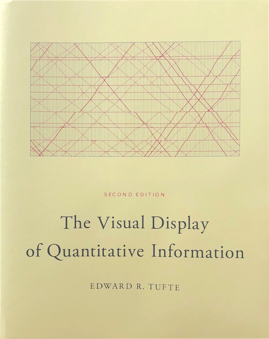
The Visual Display of Quantitative Information by Edward Tufte (1986).
The first thing I learned from it was that there are no “golden rules” that work for all your visualizations. Visualization are very heterogenous. They communicate all types of data using color, shapes, angles, size, shade, and other visual variables.
The second thing I learned was that, while analyzing “golden rules”, you develop the critical thinking and intuition that helps you create effective information visualizations. Here are the principles for graphical excellence that Edward Tufte proposes in his book:
- Above all else, show the data. Create the simplest graph that conveys the information you want to present.
- Maximize the data-ink ratio. Every bit of ink requires a reason. Nearly always, that reason should be to present new information
- Erase non-data-ink.
- Erase redundant data-ink.
- Revise and edit.
The above mentioned data-ink ratio is a metric proposed by Tufte to measure the amount of ink that a graphic uses to exclusively represent data/information. All the pixels that do not meet this requirement are considered non-data ink (this was written in 1986 – ink was a more popular term than pixels at the time).
What I like about these principles is that they highlight the fact that graphical excellence is an iterative process. In every iteration, we rethink whether each pixel in the visualization is really necessary. Ultimately, in every visualization we must make sure that we are presenting the data and its message — nothing else. There is actually a name for all those superfluous elements that should be left out of the visualization: chartjunk. A typical example of chartjunk are the 3D effects — they simply add pixels to the image without revealing any new pattern of the data.
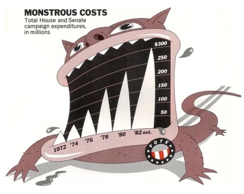
Example of chartjunk provided in Edward Tufte's book.
There are many other relevant concepts in Tufte’s book (e.g., graphical integrity) but we have to move on. I recommend reading the book as it is a quick-read and full of practical examples. The main thing I earned from reading the book was critical thinking. Now, whenever I look into a data visualization, I start reasoning about whether it is presented in the most effective way.
The Guidelines
Although there are no “golden rules”, one should keep in mind some basic guidelines that work most of the time. They are useful as long as we use them wisely, always having in mind that above all else, we want to show the data. So, here is a list of all the guidelines I was able to collect from different sources. You may find these referred at the end of this post.
Guideline #1 – Visualizations ought to be self-explanatory. If you require the reader to go back and forth between the text and the figure, you are asking for an extra effort. Simple things help fix this. For example, having a clear title or caption is half-way to having an easy-to-read figure. Moreover, all axis should be carefully labelled and presented with the respective units of measurement.
Guideline #2 – Turn off the box around the figure. The same for the boxes connecting the axes. This is so common, and I actually find it strange that most libraries draw these boxes by default (e.g., python visualization library Matplotlib).
Guideline #3 – Only have one x- and one y-axis. It is very tempting to use two y-axes to compare different variables and to present data patterns from different angles. Not only it makes the visualization overwhelming and difficult to understand, but also it may inadvertently pose spurious correlations. Tyler Vigen’s work brilliantly exposes this issue, using this strategy to establish correlations between variables that are totally unrelated.
Guideline #4 – Use visual variables (color, shape, shade) only for data variation.
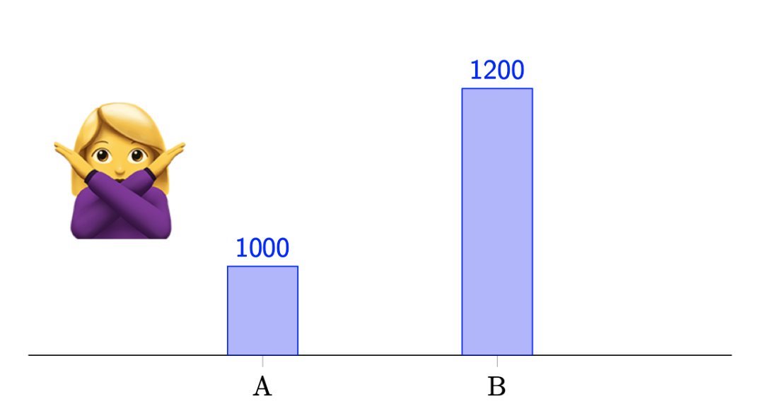
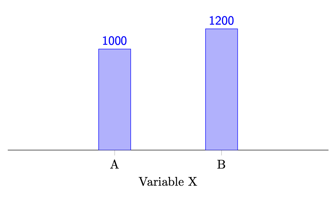
Guideline #5 – Axes must start at a meaningful baseline. E.g., bar charts should start at zero (most of the time). When this guideline is not followed, some data patterns will most likely be distorted. See the example in the figure below.
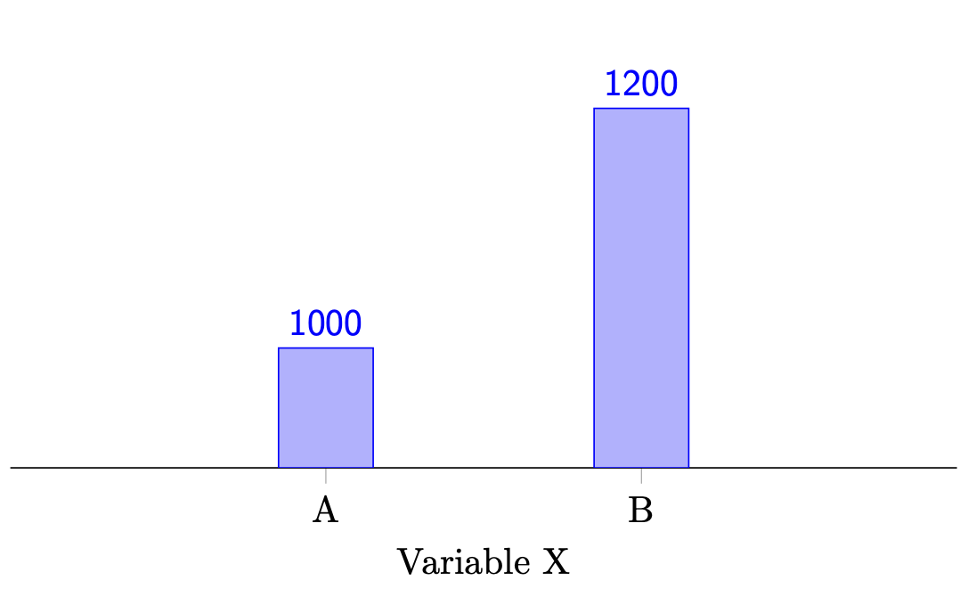
The height of the bar of B looks three times bigger than the bar of A – an increase of 300%. However, from A to B the data only increases 20% (my math: (1200-1000)/1000 * 100%).
The y-axis is starting at 900 instead of starting from its natural baseline: 0.
This distortion is often used to amplify results, misleading the reader. The same graph without distortion would look as follows:
Guideline #6 – Never use different colors to represent the same kind of data. It is tempting to use different colors only for aesthetic purposes. The downside is that it inherently asks our brain to understand the reason for that variation. This is a waste of energy you shouldn’t ask from your readers.
Guideline #7 – Label elements directly, avoiding indirect look-up. Avoid requiring your reader to go back and forth through the different elements of your graph (and sometimes text) to understand your figure. Remember what I said about waste?… For example, avoid using a legend when you can label that information directly in the objects without making the graph more complicated. This is, of course, one of those rules with many exceptions. Never forget to be critical about guidelines! The figure below shows two bar plots: the first does not follow this guideline; the second applies this guideline by labelling the values directly on top of each bar. Which one do you think is easier to read?
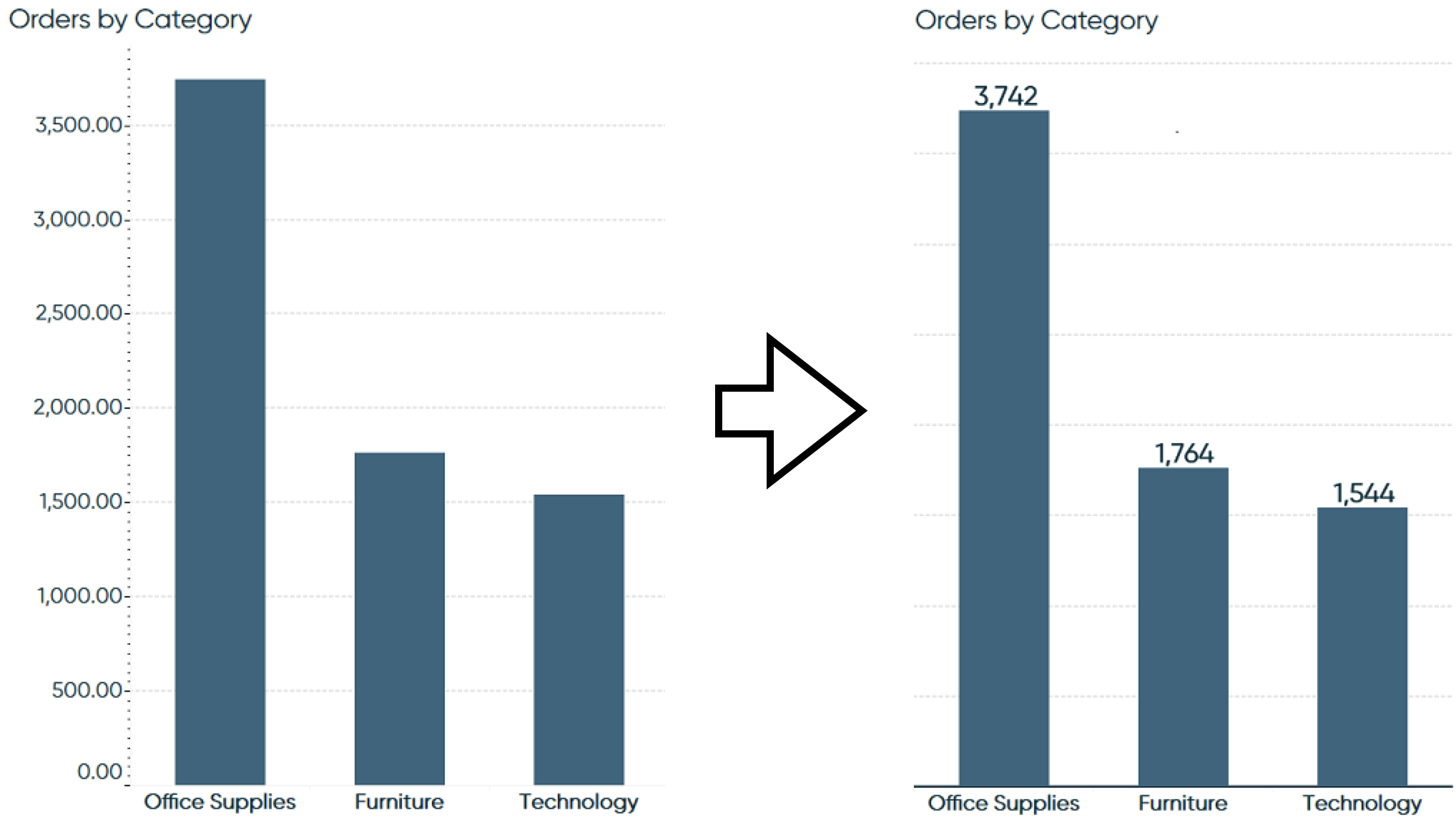
Plots from Ryan Sleeper’s article Data-Ink Ratio Animation and How to Apply it in Tableau.
Guideline #8 – Text labels should never be rotated (nor vertical). E.g., use a horizontal bar chart when category names are too long. This seems like a tiny detail, but I recommend you to try it the next time you create a visualization. Details matter.
Guideline #9 – Highlight what’s important. An image is worth a thousand words. And your visualization is no exception. But you need to guide the reader to a few messages you find essential . You don’t want your readers to waste energy processing irrelevant messages while overlooking the most important ones.
Guideline #10 – Use bold type/lines only to emphasize something. This one follows the previous guideline. Keep your reader focused and straight to the point.
Guideline #11 – Don’t use 3D effects. I hope I don’t need to explain this one. 🙃
Guideline #12 – Avoid pie charts (and donut charts). It is difficult to compare many slices in a pie chart. Very simple charts are the exception.
Guideline #13 – Sort data for easier comparisons. E.g., in a pie chart or bar chart, it is easier to compare the sizes of the different bars if they are sorted according to their size.
Guideline #14 – Don’t be afraid of creating separate graphs. If your graph is getting overly complex, think of ways of dividing it in multiple graphs. A nice way of doing this is by thinking about the messages you really want to convey in the figure. Then, you need to divide those messages in two groups and illustrate these groups in separate graphs.
Guideline #15 – Use line plots only when variables are ordinal or numerical. Line plots connect data points sequentially and show something typically called trend between those data points. If the variable has no particular order but we show a trend between sequential data points, we might be sending a wrong message.
Guideline #16 – Care for colorblindness. It is estimated that colorblindness affects 8% of men worldwide. Thus, it is important to make sure that the color you use to highlight data patterns is perceptible by everyone. For most people affected by this condition, red and green are indistinguishable – use these colors with care. Sometimes it is hard to avoid using red and green, as they are typically used to denote good and bad, success and failure, etc. In these cases, you may want to pick red and green colors that differ in their saturation level. Test your images with tools like Coblis.
Wrap-up
And that’s all, folks. Don’t forget that for every rule there is an exception – after all, that’s what makes it fun. Thanks for reading. I look forward to hearing about your thoughts and how these guidelines may or may not help you create data visualizations. Connect on Twitter and share your experience.
Recommended Readings
- Edward Tufte (1983). The Visual Display of Quantitative Information. Graphics Press.
- Cole Nussbaumer Knaflic (2015). Storytelling with data. Wiley
- Google. Material Design Docs.
- Christa Kelleher, Thorsten Wagener (2010). Ten guidelines for effective data visualization in scientific publications.
- Ryan Sleeper. Data-Ink Ratio Animation and How to Apply it in Tableau.
@misc{cruz2021effective,
  title = {16 Guidelines for Effective Data Visualizations in Academic Papers},
  author = {Lu\'{i}s Cruz},
  year = {2021},
  howpublished={\url{http://luiscruz.github.io/2021/03/01/effective-visualizations.html}},
  note = {Blog post.}
} © 2021 – onwards by Luís Cruz. Licensed under the