Is Notion "Greener" on Web browser or Desktop?
Mitali P, Pia A, David V.
Ever wondered how much energy is consumed by some of the softwares that we use often ? We explore the energy consumption of one such software - Notion , something one might find using quite often for organising notes. Primarily we see if its energy-efficient to use Notion on desktop or on Web Browser.
Note-taking software is becoming increasingly feature-packed. We use various note-taking software often, but are we saving more energy by using it on the desktop version or running it on the web? Even though Notion provides similar features to the end user, using their native version or Web counterpart might lead to different levels of energy consumption and performance. In this blog post, we asses the energy consumption between the desktop version and the web version of Notion.
At TU Delft many students create, collaborate and organise their notes on Notion. This can be attributed to the fact that Notion allows for creating databases, integration with Google Drive, GitHub and its use of LaTeX library to render math equations.
While sustainability might not be the integral aspect of the Notion software we can make it an afterthought and use it in a manner where we reduce overall energy consumption or save our laptops energy.
Methodology
We conducted the same experiment (login to logout) on two different modes of operation of notion, one mode being desktop and the other mode being notions web application on Chrome web browser. We are using the Cornell note system template as a use case for both modes. We have tried to include all the basic features that we think users usually use on Notion in the workflow pipeline. The experiment flow for interaction with Notion is as follows: open Desktop app on fullscreen -> login using google sign in option(we created a dummy account for this experiment) -> create a new page using the Cornell system template -> write a page title with some basic text -> write some notes-> make a todo list -> upload a PDF -> create new (linked) “page-in-page” -> write a math equation -> write a piece of code -> check a todo -> logout A same flow was followed for the web application too.
Each iteration of the experiment is around 3 minutes, with a 60s wait inbetween each run, resulting in a total run time for the whole experiment of about 4h.
We ran an automated script to open Notion on the desktop and the web version on Chrome. Each of them was run 30 times and to prevent the order of experiments influencing the resulting measurements, the experiments were randomly shuffled. For each experiment, we took the following measurements: elapsed measurement time(ms) and System_Power(Watts) which we converted to Joules.
Hardware set up
We conducted the experiments on a MacBook Air M1 Laptop with 8GB RAM running macOS Sanoma 14.2.1 (23C71). The specific software used for the experiment is:
| Software | Version |
|---|---|
| Notion Desktop | 3.2.1 |
| Google Chrome Browser | 122.0.6261.69 |
The energy consumption was measured using EnergiBridge
Before executing the experiments it is important to record the state of the system under test so that the state can be kept as consistent as possible between experiments. In addition to the hardware and software specifications above, we made sure that the laptop was in the following state to minimize confounding factors:
- Stable Wifi6 Connection with an average throughput of 250mbps.
- Notifications turned off
- Power cable plugged in
- Screen brightness set to 100 %
- No applications/programs/services running in the background.
Since hardware temperature affects the energy consumption among the experiment runs which impacts the results, we set up a warm-up routine with a dummy task of calculating the Fibonacci sequence for 30 seconds to minimise the temperature difference. The experiment structure was as follows :
- Warm up CPU
- Shuffle and run 60 iterations(30 for desktop experiment and 30 for chrome browser experiment each)
- Start measuring
- Start Notion Workflow (mentioned above) using an automated script
- Stop Notion Workflow and Logout(also automated)
- Stop Measuring
- Wait for aprox. 10 seconds
- Delete the current created note page
- Wait for 60 seconds
Replication
The code to replicate the experiments can be set up using GithubNotionSSE For the setup, we have created a dummy Google account for Notion login, the details of which are in the GitHub repository. To get the set up running on a Mac:
- Install Notion on Desktop
- Set up the dummy Google account on chrome, each experiment will log in and logout using those credentials.
- Set up EnergiBridge
- Run the main Python file
Results
First run
The data produced from the experiments was analyzed by plotting the energy consumption for each experiment. The data was plotted using a violin plot to show the distribution of the data and a time series plot to show the energy consumption over time. After producing the violin plot, it was observed that there were some outliers in the data for the web experiment (seen in Figure 1).
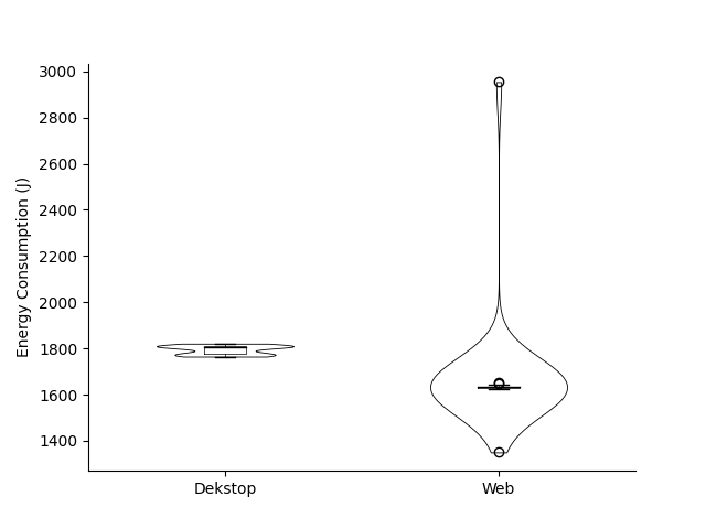
Figure 1: Violin plot of energy consumption (J) with outlier data (first run).
The time series plot (seen in Figure 2) also showed the presence of outliers in the data.
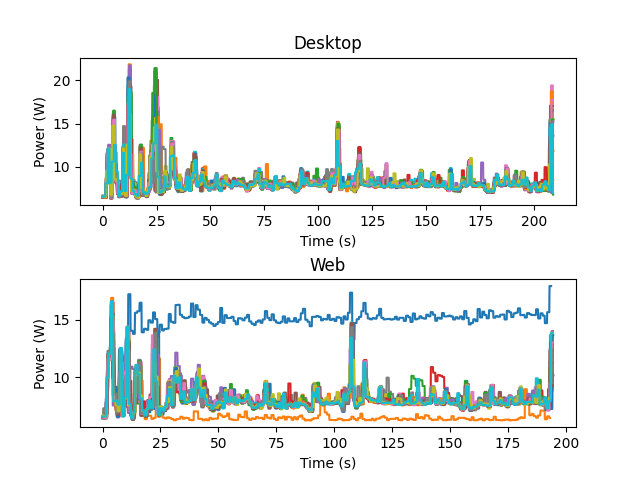
Figure 2: Time series plot of power consumption(W) with outlier data sets (first run)
The outlier data sets appear to have a near-constant energy consumption over time, which is not consistent with the rest of the data. Furthermore, the energy consumption of the outlier data sets is significantly higher than the rest of the data for one of the outliers and lower for the other one. Why these outliers are present in the data is not clear, especially as the power usage reported by the outliers has a very low variance.
Without Outliers
After removing the outliers from the data, the violin plot (seen in Figure 3) and time series plot (seen in Figure 4) were produced again. Furthermore, the min, max, average and variance were calculated for both experiments. The results are shown in Figure 5.
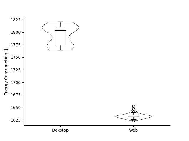
Figure 3: Violin plot of energy consumption (J) without outlier data (first run).
The violin plot for the web experiment shows a normal distribution, albeit with a very low variance. The violin plot for the desktop experiment appears to show a corrupted distribution, with a very high variance. We observe that from a first glance, it is very clear that the desktop version of Notion consumes more energy than the web version.
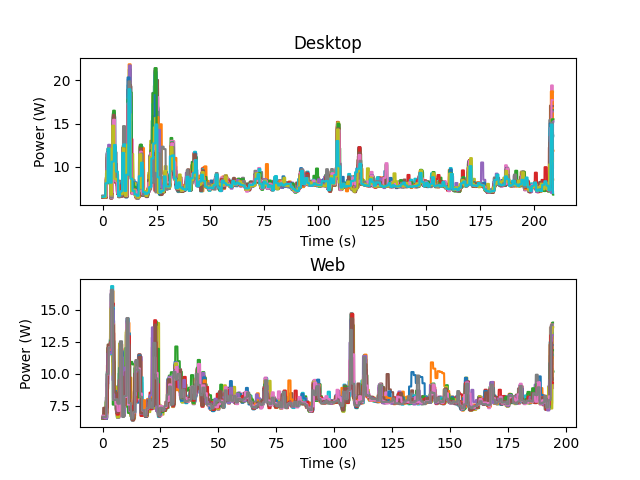
Figure 4: Time series plot of power consumption(W) without outlier data (first run).
The time series plots for both experiments show a correlated pattern, where the first 50 seconds experience a large oscillation in power consumption. We also observe a peak around the 105 sec mark for both experiments. Lastly, there also appears to be a peak at the end of every experiment run.
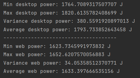
Figure 5: Metrics for the Notion experiment (first run). discussion:
Our metrics confirm what was already clear from the plots. The desktop application has a higher energy consumption, while at the same time having a vastly larger variance.
Second Run
Even after removing the outliers, the distribution of the web desktop data is not normal. Therefore, we decided to rerun the experiment under more stringent conditions. In the first run, we used chrome to log in for the desktop experiment. In the second run we added an extra step to the experiment to ensure that the browser was closed immediately after log in was complete. We assumed that it could have been a source of randomness in the data collection for first run. However, in the new dataset even after quitting chrome in the bachround for desktop , the data is not normally distributed. Only one outlier was present in the new dataset, but after analysing the size of the dataset we concluded that energiBrige had stopped measuring prematurely. We decided to remove the outlier and continue with the analysis.
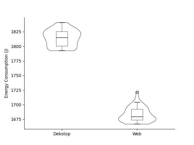
Figure 6: Violin plot of energy consumption (J) (second run).
as can be seen the distribution of the data for the desktop experiment is more “normal” than in the first run, meaning the variation should be smaller. Secondly the web experiment has a significantly increased variance compared to the first run.
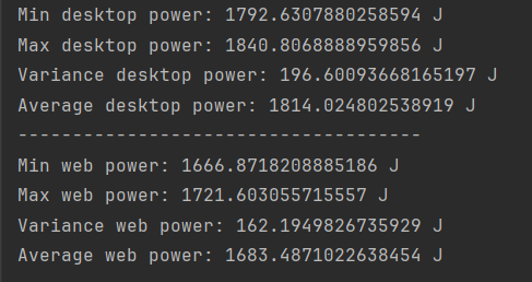
Figure 7: Metrics for the Notion experiment (second run).
We can see in the metrics of the second run that the variance of the desktop experiment has decreased significantly, while the variance of the web experiment has increased. The average has increased for both cases by 1.2% and 3% respectively.
Discussion
The differences are pretty overwhelming for the same use case. Because our distribution is not normal we cannot confidently say that the errors that affected the desktop measurements were equally affecting the web measurements. Some of the potential reasons could be:
- Error in automated experimental execution
- Unusual task being run by the system despite all background processes and notifications being turned off
- Since we are relying on third-party software(Energibridge) to collect the data, we cannot ensure its accuracy.
After we remove the outliers we can see a large interquartile range for the desktop box plot which implies a significant variability in the energy consumption and less consistency in energy usage across different runs. The variance on the desktop version is more than 10 times the variance of the web for the first run. For the second run the variances are on a similar order of magnitude, but the desktop variance is still significantly larger than the web variance. This could stem from syncing and background processes such as syncing data across devices (Note: Notion run on desktop was Online). It can also be attributed to the software code, performance optimisation can lead to fluctuations in energy usage.
Most native desktop applications tend to be energy efficient compared to their web counterparts as the code leverages platform specific resource optimisations potentially leading to lower energy consumption. For example: local caching mechanisms as against frequent network requests, conserve more energy.
We deduce that Notion’s desktop app is just a wrapper for the website and is not truly a “native” application. This severely affects its performance on desktop causing it to be resource intensive and heavy due to added runtime bundles for a full web browser(like Chromium).
Limitations and Issues
Limitations present themselves in these experiments in various forms.
- The Notion software interacts with a remote system, making the power measurements non-deterministic.
- Outliers present themselves in the data in the form of two data sets with very consistent power consumption, albeit with a higher and lower consumption than the other experiments. How these outliers came to be is not clear, as it could be due to a variety of reasons (e.g. Energibridge software).
- As the application has to interact via the internet it is subject to network latency and throughput. Creating variations in the energy consumption.
There are also limitations to our research question and experiment namely :
- Wether the scenario we implemnted is realistic , we determined the flow based on popular features used on Notion. Of course real life scenarios differ quite a lot.
- Although the whole experiment is automated, accurately pointing out which part of the energy measurement pipleine consumes the most energy is difficult unless we isolate and measure each part of the Notion workflow set up.
- The distribution of data is not Normal even when we remove the outliers.
Conclusion:
The results indicate that Notion web is energy-efficient compared to the desktop application. It is also important to note that this experiment is accompanied with some limitations in terms of measurement accuracy and given the scope we cannot dive into the details of what causes the data distribution to be not normal. Again isolating which part of the workflow consumes most energy can be part of the future work. Although our results seem contradictory to the expectation, an anectodal experience in the form of a redditThread and anotherRedditThread seems to offer the same conclusion.
Back to all projects